We’re thinking pink.

The Shade Shop is a Charlottesville institution and the nation’s leading retailer for high-end lampshades and lighting, so we were thrilled when they contacted us with a design challenge: elevate their printed materials to better reflect their brand. The client felt there was a disconnect between their existing print collateral–notecards and envelopes, business cards, hang tags, fabric swatch cards, stickers and more–and the very high quality of the lampshades and home decor they provide. The Shade Shop’s team is also known for outstanding customer service and industry knowledge, so we wanted to craft design concepts that would communicate luxury, refinement, and expertise.
The Process
The only brand element that had to be part of the new look was the company’s logo, so this was an opportunity to introduce a new color palette and graphic elements. And since the majority of their customers shop online, we focused first on the unboxing experience. The client wanted a better way to present their standard packing slip, which was printed on office paper, folded, and placed atop the contents of the box along with a notecard. From this starting point we began exploring ways to simplify and enhance the contents of the box.


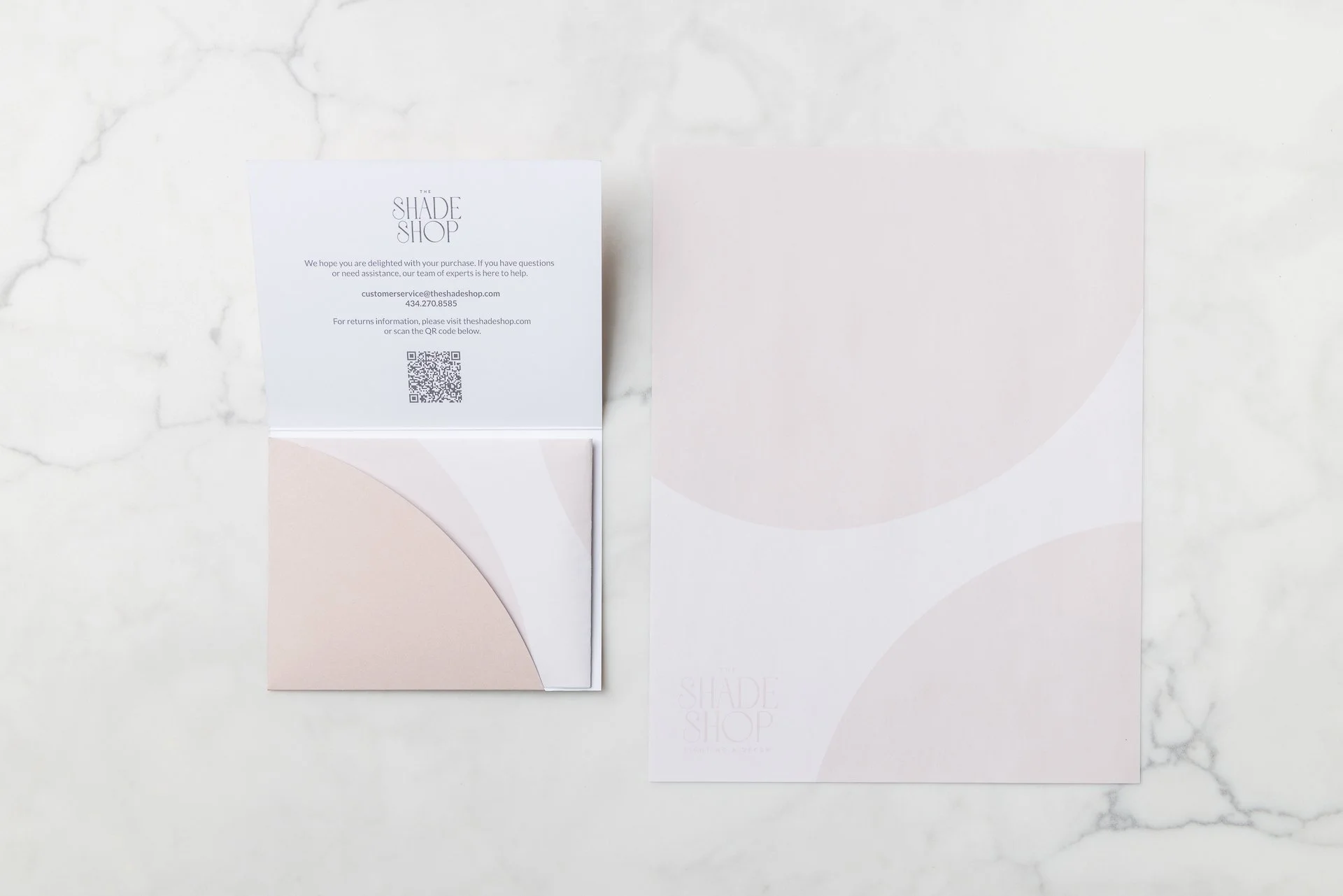
Our first goal was to create a single piece that would contain the packing slip and include the information from the notecard, plus the shop’s return policy. We made multiple prototypes of folded pieces in vertical and horizontal orientations, studied quality paper stocks, and considered special features like raised spot gloss graphics and metallic foils. We worked with The Shade Shop’s fulfillment team to find a shape that would be easy for them to use and would look elegant sitting atop their custom tissue paper. After our discussions we decided on a custom folder with a curved inside pocket that would hold the packing slip and include a message to the customer–plus contact information and a QR code for the online return policy–printed on the inside. The next step was to finalize the color palette and expand on the new visual style that was emerging from our design exploration.

The Shade Shop’s interior is full of beautiful shapes, colors, and textures, as well as panels of stunning handpainted wallpaper. We wanted to use colors inspired by the shop’s gorgeous surroundings, so we worked with the team at Worth Higgins & Associates in Richmond to create a custom shade of neutral pink just for this project. And we love that they named it Chime Pink! With the new brand color selected, we could apply the palette to the custom folder and refine the other print pieces for a cohesive look. Our next challenge: what to do about the packing slip itself, which is generated through sales software with limited options for customization?

Because we couldn’t redesign the packing slip to match the new brand style, and because it would be partially visible when the custom folder was opened, we offered the client another solution. We designed letter-sized watermarked paper using lighter tints of the brand colors to be printed on one side only. This way the client could print the packing slips on their office printer as usual, but the back side with branded graphics and the company logo would be visible when the slip was folded. When the customer opened the folder, they would see a continuation of the brand elements rather than plain white paper. The large graphic shapes used for the background were taken from the counter inside the letter O in The Shade Shop logo; while the outer form of the O is a perfect circle, the inner shape is more unique and organic. This shape, along with the color palette, formed our kit of parts for designing the rest of the suite of print materials.
The Result
In addition to the custom folders, which were printed, die-cut, and glued in-house, Worth Higgins also printed notecards and business cards with finely detailed gold foil stamping to complement two tints of the main brand color. Our local print partner, T&N Printing, produced envelopes, fabric swatch sample cards, hang tags for pricing in-store items, stickers in three different sizes, the watermarked packing slips, and in-store flyers, going the extra mile to match the custom color formula. Now when we visit The Shade Shop, we are so excited so see the brand’s new look in use.


Chime Studio understood our branding goals from the start and delivered thoughtful, creative solutions that brought a distinctive, elevated look to life. We worked closely with Erin throughout the process, guided by a thorough creative brief and clear, timely, and open communication. The final materials make our brand more visually cohesive, refined, and memorable for our audience.
Nancy Ryan, General Manager, The Shade Shop
If your brand could use a refresh, or you’d like to take your print materials to the next level, we hope you’ll get in touch.